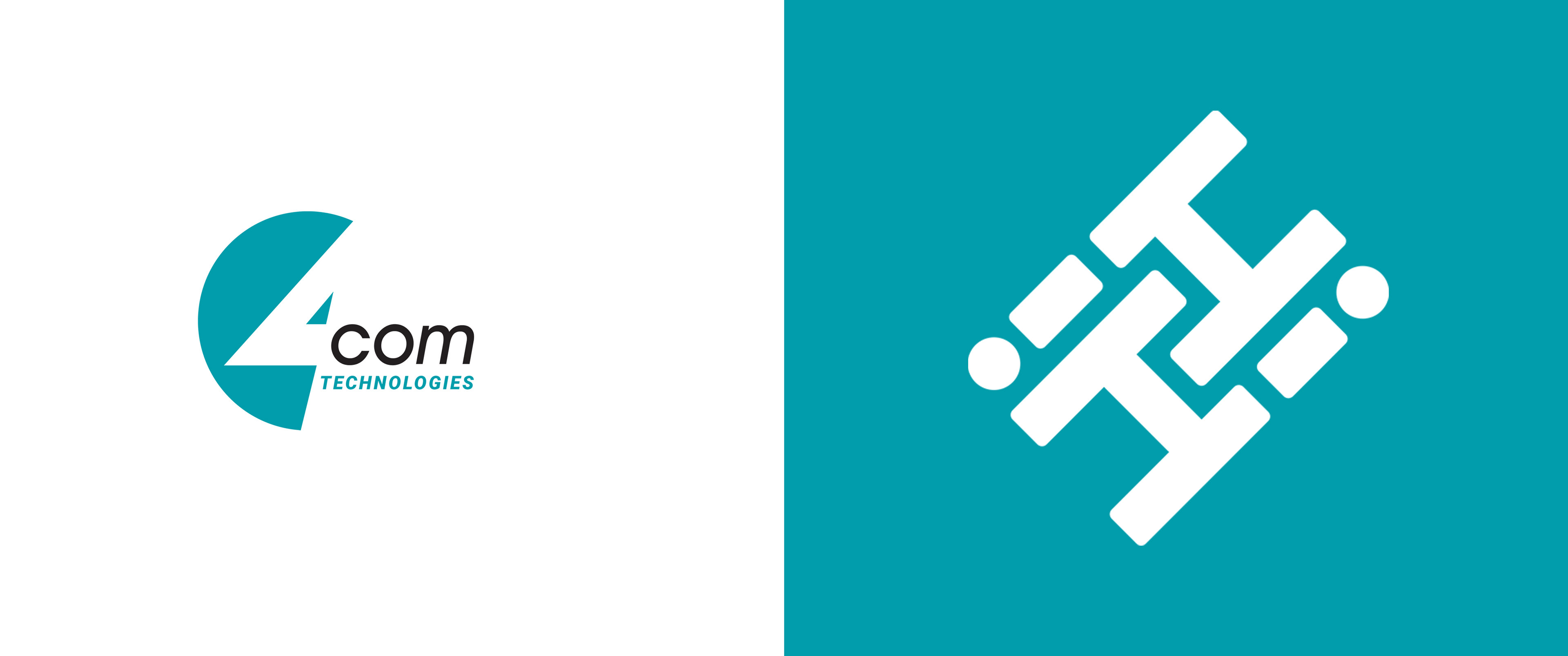
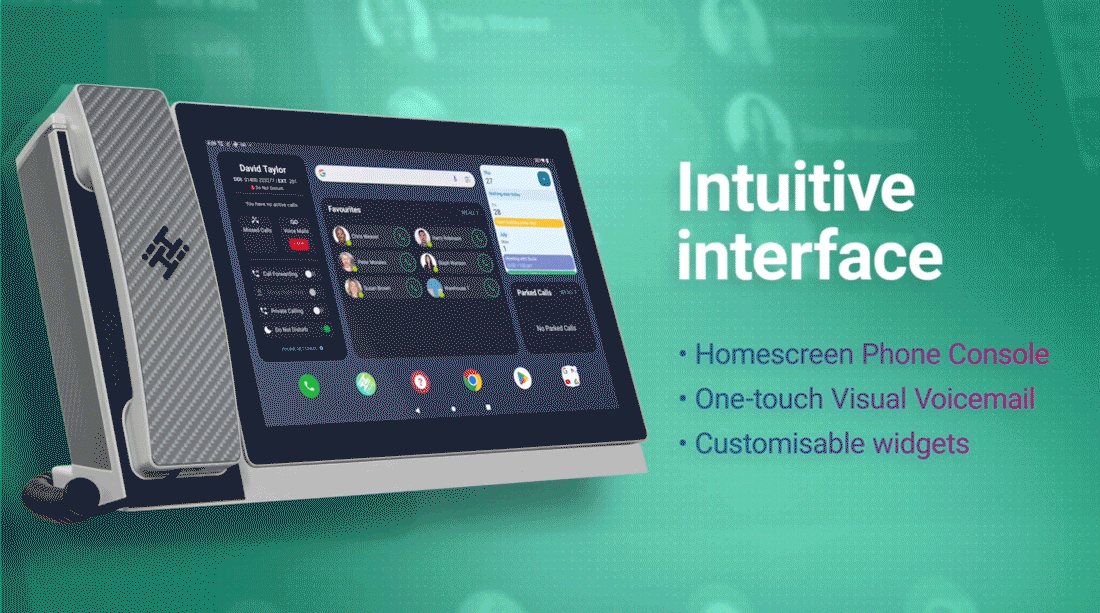
4Com needed an image change. It was cold and corporate but its new video desk phone was all about stronger human connections. So we renamed it and rebranded it into something warm with this interlocking logo.
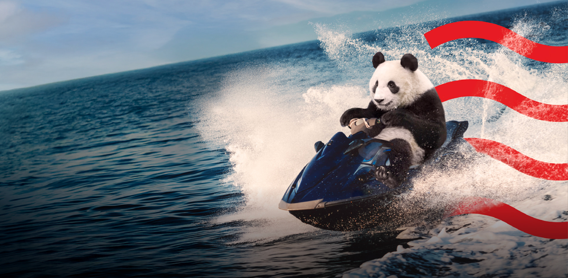
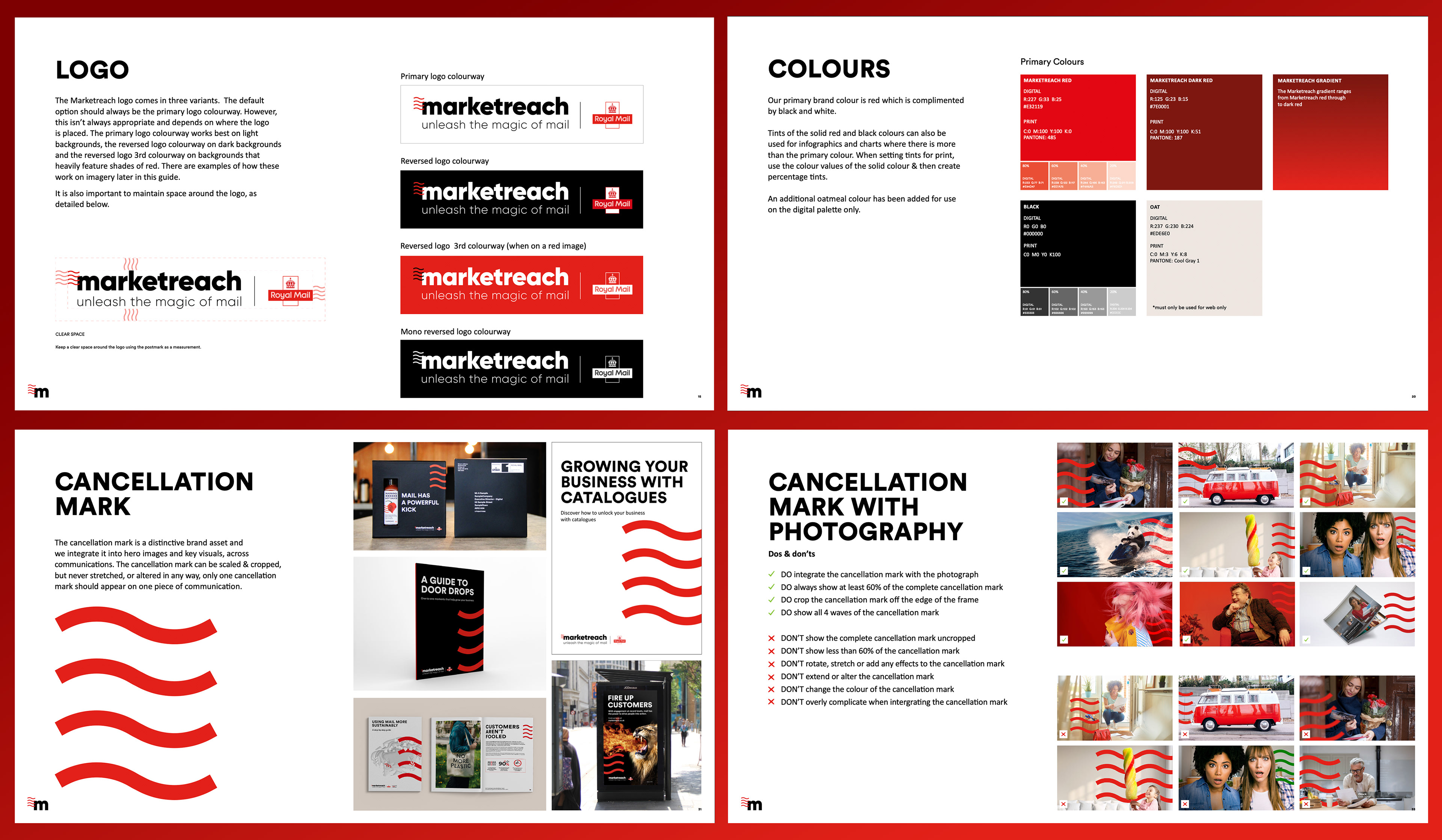
Due to the rise of digital media Marketreach had become a quite brand hiding behind Royal Mail. So we introduced a powerful, ownable graphic device taken from the 'cancellation mark' used on stamps and gave them back the lead character energy they deserved.
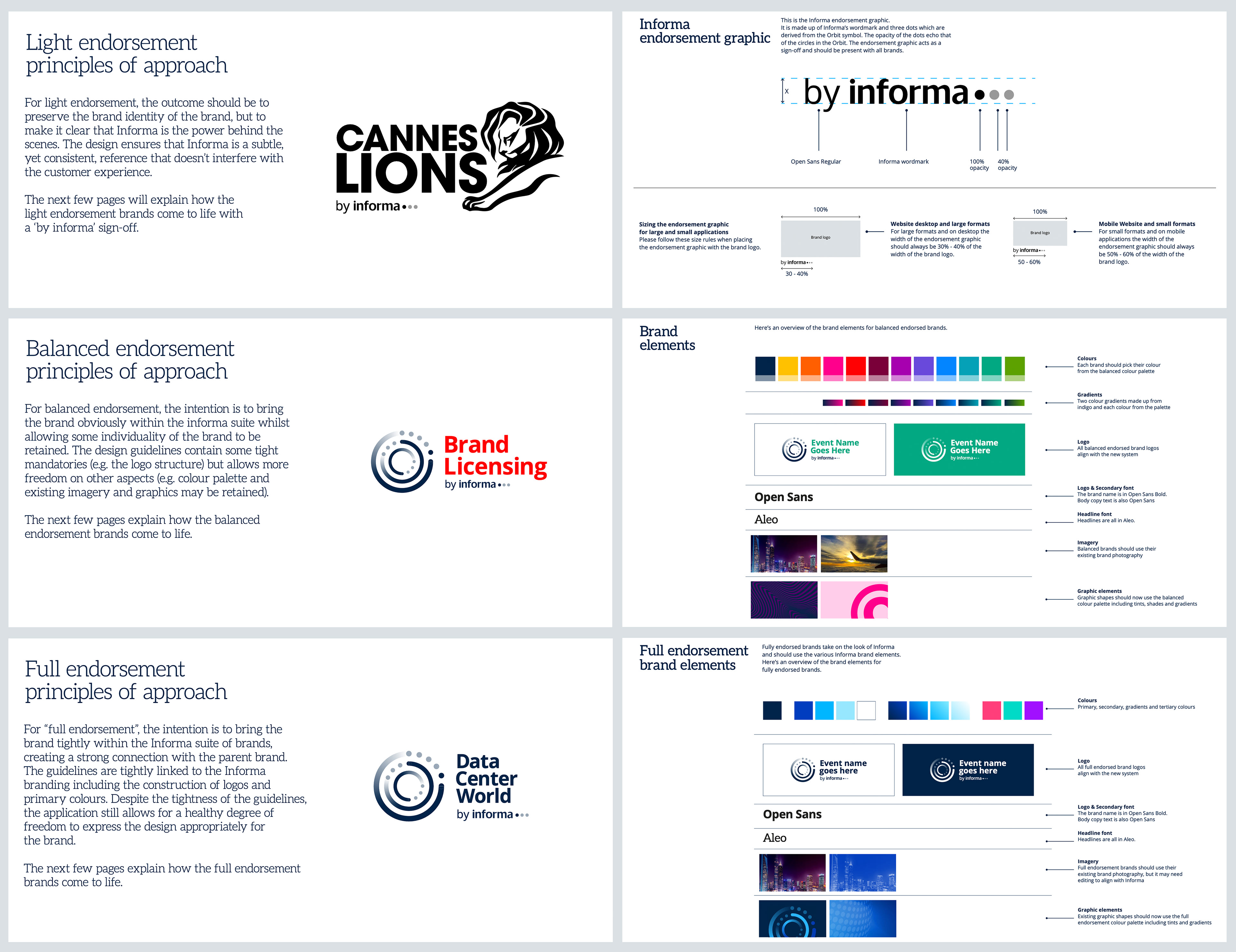
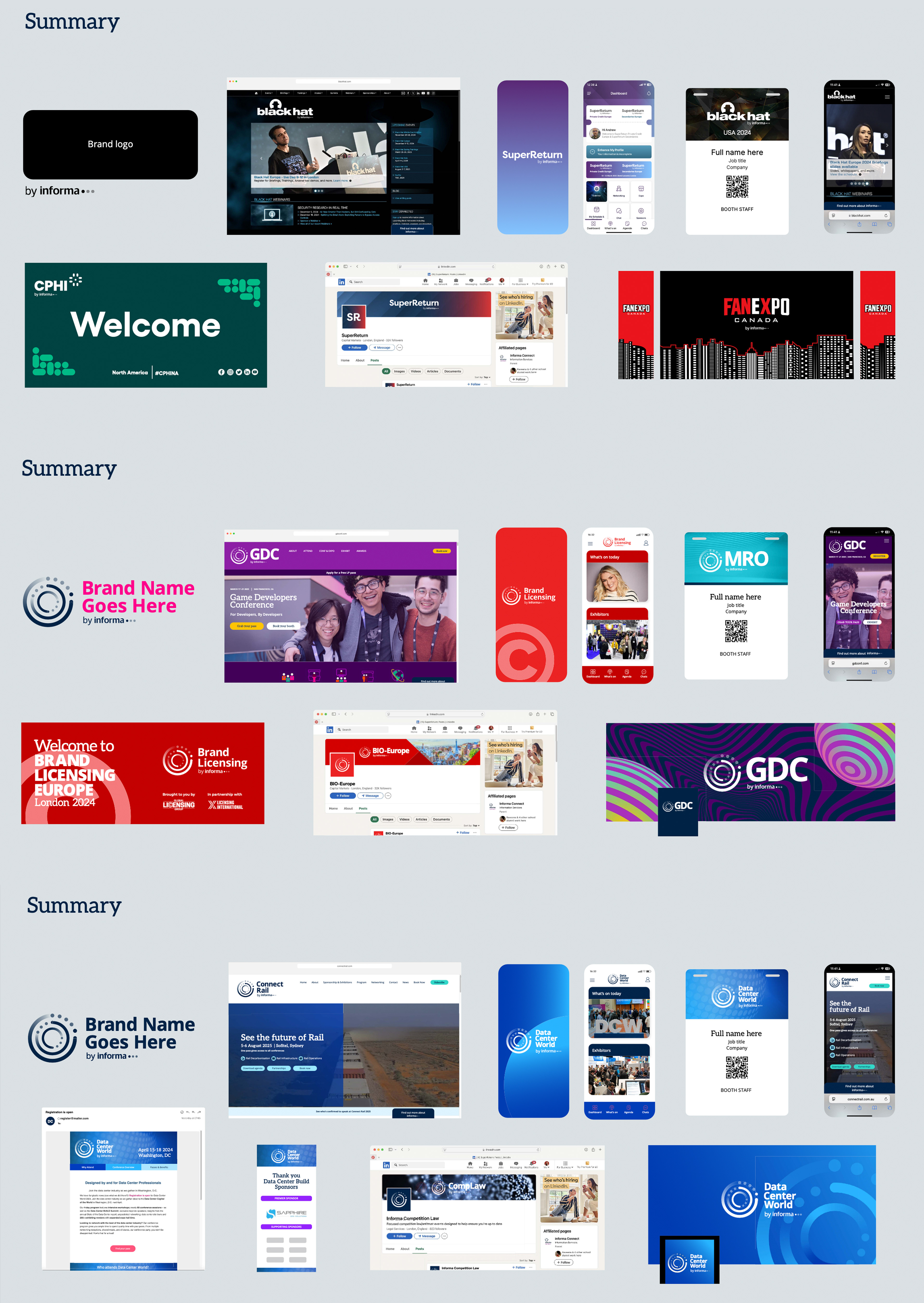
Informa is one of the biggest companies you've never heard of and that was a problem. We created a global brand architecture to help surface the brand and help make it as famous as some of the companies it owns.

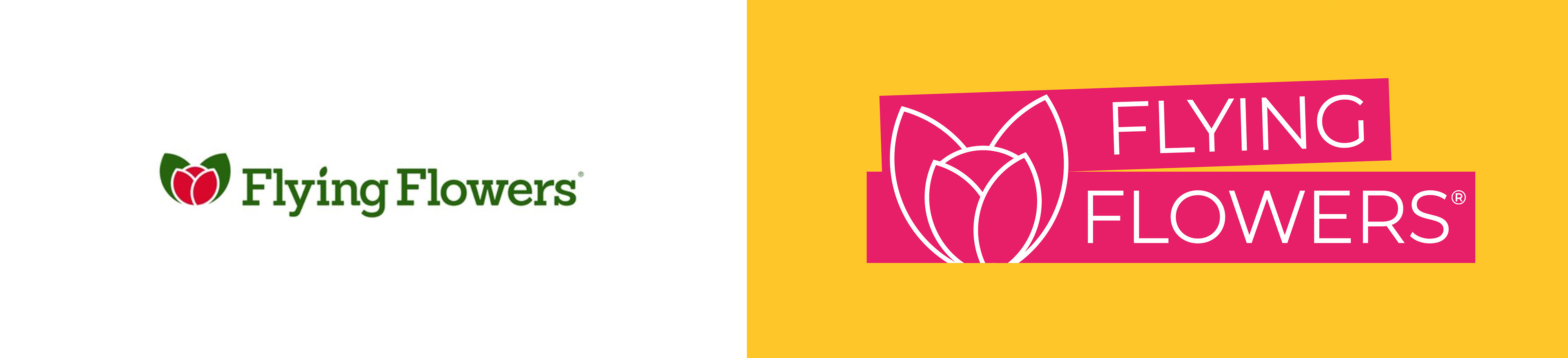
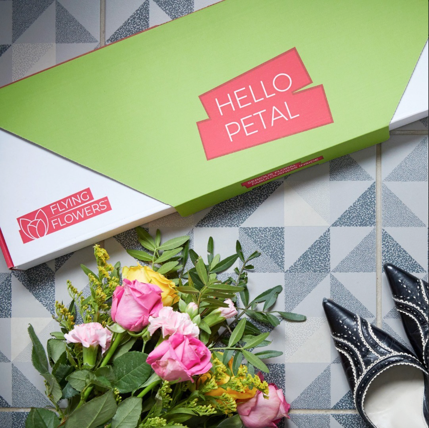
Flying Flowers wanted to appeal to a younger, funner audience. So we refreshed the brand, evolving it into an colourful, playful place to get flowers from.